
 |
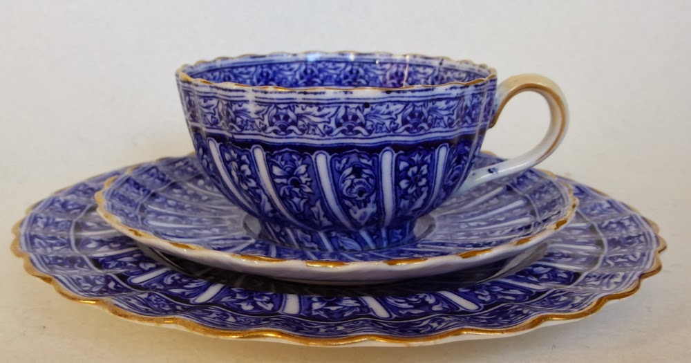
| Cup, saucer, & plate in pattern 1/4873 bird's eye view |
I think of this design style as 'patterns in panels' and they appear in various guises, in and out of fashion, throughout the whole of the 19th and 20th century, in production from the Spode factory. Sometimes the panels in the pattern are straight, other times twisted or 'swirled' as in this design.
I thought it might be interesting to look at my cup, saucer and plate in a bit more detail (yes, it did become mine). It is a blue printed pattern with gilded detail. If it was plain printed ie with no extra decoration, then it is unlikely to have had a pattern number, as the copper plate from which it was printed served as the record. But the addition of the gilding means it was allocated a unique number. The pattern number is clearly visible as part of the backstamp. It is 1/4873 and in the image of the backstamp you can also see the workman's, probably the gilder, which at this period was likely to be a man.
 |
| Backstamps |
'China' means a bone china pattern, also indicated by the prefix 1/ which is a series of patterns usually referred to as the '1 over numbers'.

'BT' indicates a Breakfast Tea pattern but I may be wrong. It is a sensible guess though, for example, it was a long time before I discovered that AD meant
After Dinner in 'AD coffee cup'. These codes are not always written down as, generally, everyone
who needed to know at the time, knew.
'Plain Walpole shape' tells us the shape of the ware for this pattern number... or does it? My 3 pieces are the same pattern with the same number but on Chelsea shape.
'as 1/4872 But printed in Cobalt blue in place of Red' tells us that this is
 |
| 'Chelsea handle half traced'. |
There are also some other notes and one which is relevant to my pieces is 'Chelsea handle half traced'. This described the detail of the style of decoration for the handle by the gilder who is to trace it ie add a delicate and tapering line of gold on the outside edges of the handle which just goes halfway round. There is also an instruction that the gold is to be burnished. Gold is dull when it has been fired and can be finished in different ways depending on cost and desire. Burnishing with tools tipped with agates and bloodstone produced the desired effect. This skilled job was done by burnishers. You can view burnishing tools on Staffordshire Past Track - click HERE>
The printed 'COPELAND'S CHINA' backstamp in the style on my pieces was used from about 1862-1891.
I have to confess this is not the most perfect piece of ware from the Spode factory I have seen. The bone china body is lovely but there are errors in the printing. In the image of the handle you can see where part of the print has caught on the handle making a blemish. Most confusingly of all this design was not meant for the fluted Chelsea shape. The engravings don't fit it correctly and the application of the transfer could definitely be better. The fact that the engravings were for a different shape must have made it difficult.
 |
| Cup detail showing errors in the application of the print |
There is pattern in the modern era which shows how 20th century production still used the older patterns as a strong influence. This is Provence pattern designed by Pat Albeck for Spode on the Royal College shape. It has pattern number Y7843 introduced in 1958. Royal College shape was designed by Neil French and David White of the Royal College of Art with Spode, under the Copeland ownership, for the A Room of our Own exhibition in 1958, following a drive by the college for stronger links between student designers and industry. At the time of this design Albeck was a student at the Royal College of Art and went on to a glittering career in textile design. She is closely associated with the famous Emma Bridgewater ceramics company in Stoke-on-Trent as she is mother to Matthew Rice, a well-known designer, and he is married to Emma!
 |
| Provence pattern 1959 china catalogue |